Is there anything more pleasing that a lovely graph? Probably… but anyway it’s good to know that The Economist churns them out with some regularity. I’m currently a bit partial to this one (which I’m calling “The Ballerina”, but that distracts from it really):
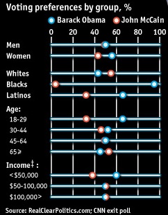
Taken from “How the race was won“. You can see more of these over at The Economist Daily Chart page.